Redesigning the BookMyShow Event Manager App
BookMyShow
Introduction
BookMyShow has evolved from being India’s largest purely online ticketing platform for movies to end-to-end management of live entertainment events including music concerts, live performances, sports events, and more. Be it events like U2’s The Joshua Tree Tour & music concerts by international artists such as Coldplay, Ed Sheeran, and Justin Bieber, or venues like Singapore wonderland which gets a footfall of hundreds of thousands of fans. Managing events of a large scale are challenging and hence we launched the event manager app in 2018 which gave organisers and BookMyShow’s on-ground operation teams more control while managing these events. The former event manager app worked well in the Indian context but was becoming difficult to scale and operate while expanding to other markets.
This app streamlined the operations like
Scanning and validating e-tickets/m-tickets at entry/exit gates
Issuing physical tickets and add-ons like merchandise, beverages at the venue
Hundreds of organizers and BookMyShow’s ground operation team members, which are spread across countries like India, UAE, Singapore & Malaysia use this app every day.
My Role
Research, User Testing, Product Design, Design System
Team
1 Design lead, 1 UX Designer, 1 Software Engineer, 1 Product Owner
Company
BookMyShow
Problem Statement
It started when the Field Ops team reached out to the design team to audit their app since they felt that the UX of their event management app felt dated, and was due for a technological refresh.
We initiated a user study of user pain points associated with the current user experience of the event manager app. Through direct contact with users, we sought a further and more thorough understanding of the context. To gain insight into existing issues and obstacles faced by our operations team during event administration, we consulted with our on-the-ground personnel.
Breakdown of the Problem
Not leveraging existing mental models
The users were mostly performing the wrong action because the app did not take certain affordances into consideration
“Event Manager was accidentally scanning in exit mode instead of entry mode”
Unnecessarily long user flows were cumbersome
The primary flow itself was not optimised for efficiency in performing the tasks
“Currently it takes 3–4 sec to scan and validate tickets which is extremely high to scan tickets for bigger event approx 200,000+ tickets”
Taxonomy and naming convention were complicated
Simple functions and features in the app sounded extremely complicated that what they actually were leading to a higher learning curve
“Term access control is not understood by everyone change to Ticket Scanning — easier for laymen”
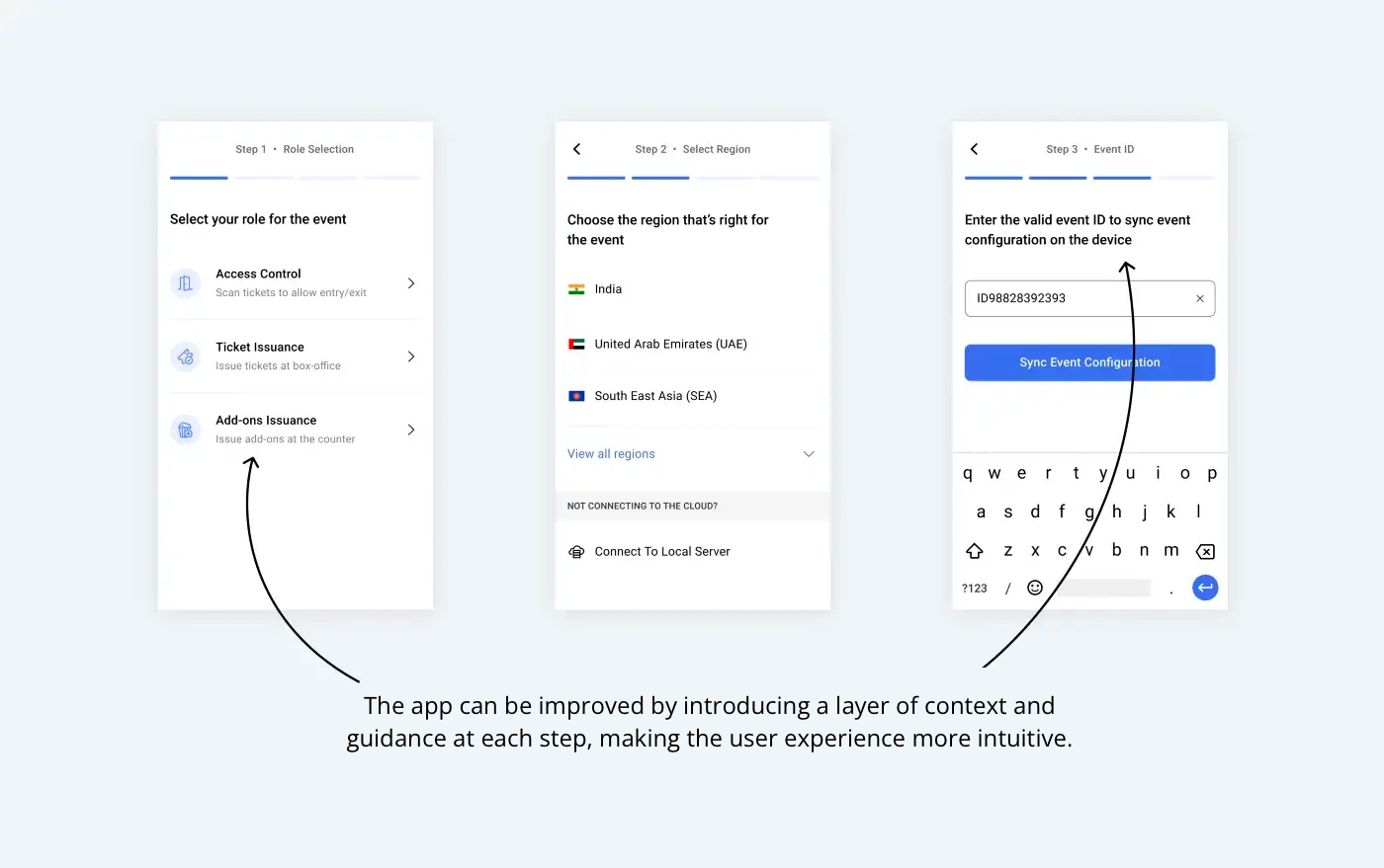
Pre-Scanning Setup Screens
Primary Scanning Screen
During our research and analysis phase, we carefully interrogated each component of the interface by doing a detailed heurestical analysis. This enabled us to comprehend the rationale behind the decisions made by the operations team in developing this application.
The Design Approach
We reduced the actionable data and designed the app to be user-friendly and intuitive by segmenting the event setup process into four straightforward steps. Each screen was designed to communicate effectively with the users and to guide them in setting up the device with the correct configuration.