Reimagining Max Bupa Digital Health Insurance
Max Bupa Health Insurance
Max Bupa, one of India’s leading Health Insurance providers, aimed to reinvent their Digital Health Insurance experience with a strong focus on helping their prospective customers make a purchase decision that works best for them and their families.
Introduction
As a Creative Director and Design Lead on this project, my aim was to lead the team of 4 to navigate the project, right from the kickoff to delivery.
On-ground research conducted in major cities throughout India helped us build the customer personas and define the design strategy for the new portal. We created a refreshed design system for Max Bupa in accordance with their brand identity and the Adobe Experience Manager framework.
My aim was to manage expectations with the client-side business teams to ensure we’re constantly aligned with their future-facing objectives and initiatives. The designs that we created needed to be co-ordinated with the internal development teams to ensure their feasibility and also be in accordance with our external Adobe implementation partner.
Results
The new design resulted in a 94% increase in user interest and lead generation for the pre-login part of the Website as compared to the pre-redesign user experience.
Responsibilities
UX Design
Visual Design Direction
Design System
Business Pitch
Project Planning
Design Strategy
Team
1 UX Designer
2 Visual Designers
Agency
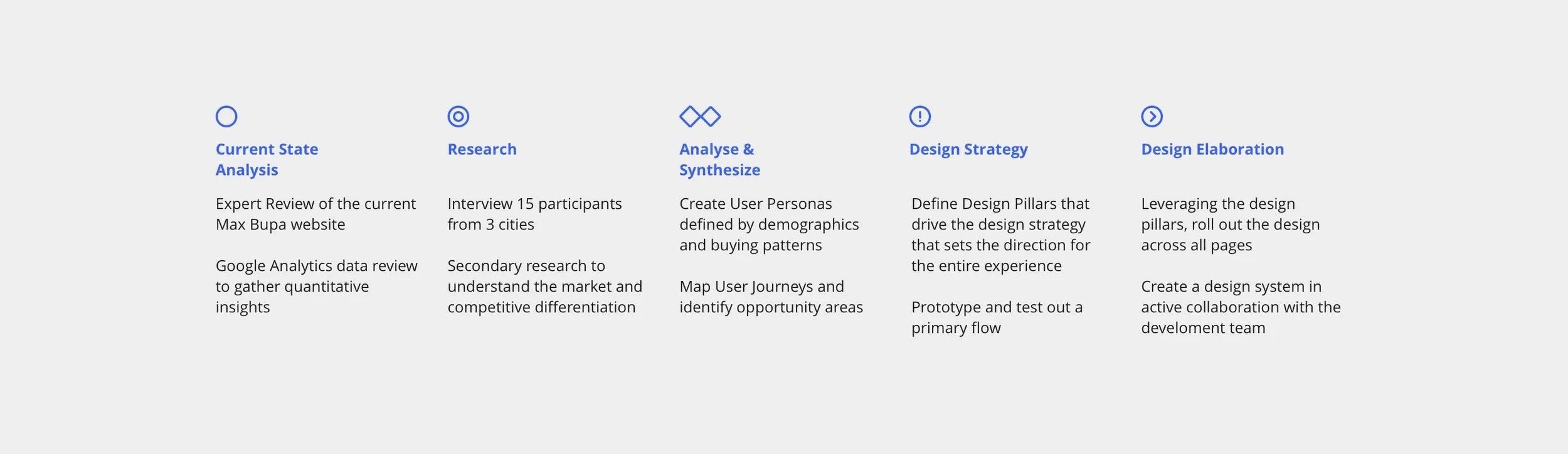
The design plan consisted of three main stages; moving from Research to Design Strategy to Design Elaboration. Our engagement spanned from Design to Front end Development.
Research Outcome
Primary Research
To understand the sentiments around Health Insurance experience in India, we interviewed customers and prospective customers from New Delhi, Pune and Bengaluru. We also interviewed key stakeholders from the Max Bupa ecosystem including Marketing, Customer Service, Agents & Direct Sales, and Bancassurance.
Secondary Research
While the primary research helped us understand customer perceptions around Health Insurance, the objective of the secondary was to understand the Industry landscape, by focusing on the following areas;
1. Competitive Scenario & product offerings
2. Industry Innovations
3. Prevalent Trends
Current Website Review
While the need to redesign was a part of the client brief, we wanted to identify the usability issues in the current website by conducting an Expert Review. A few of the highlighted issues;
1. Lack of Hierarchy in Information and fragmented navigation
2. Lack of a Search bar for immediate queries
3. Responsiveness was not well designed
4. Core business features such as “Get quote” were not identifiable
The Design Strategy
We mapped the key problems that the users faced and the possible opportunities areas that arose out of it. Through affinity mapping, we identified commonalities throughout the journey and how common strategies could solve the problems. This helped us formulate five pillars of designs strategy to guide the overall project design execution.
1. Product centred focus
Instilling sense of tangible ownership for an intangible product
Leveraging products as the key engagement
Building brand trust through product offering
Pre-login Information Architecture to centre around and tie back to the available products
2. User centred Information Architecture & Navigation
Progressive disclosure
Contextualised upfront information through user engagement
Integral nuances aiding decision making
Progressive guidance along user journey to ensure transparency
3. Humanising the Brand
Showcase the customer as brand representatives
Showcase the doctors that represent the brand to reiterate their value and credibility
Transparency and Accessibility towards Doctors and Hospitals
Personalise the user acquisition channel
4. Propagating value through Continuous Engagement
Curating meaningful experiences across journey periodically
Proactively making the user aware of what they have access to
Proactively drive multiple engagements to help gain maximum value
5. Focused post-login experience
Experience should specifically focus on how best they can utilise their insurance policy
A curated profile interface that prioritises features driven by what his policy entails
Upfront assistive services and a quicker access to their policy and the actions that they can perform
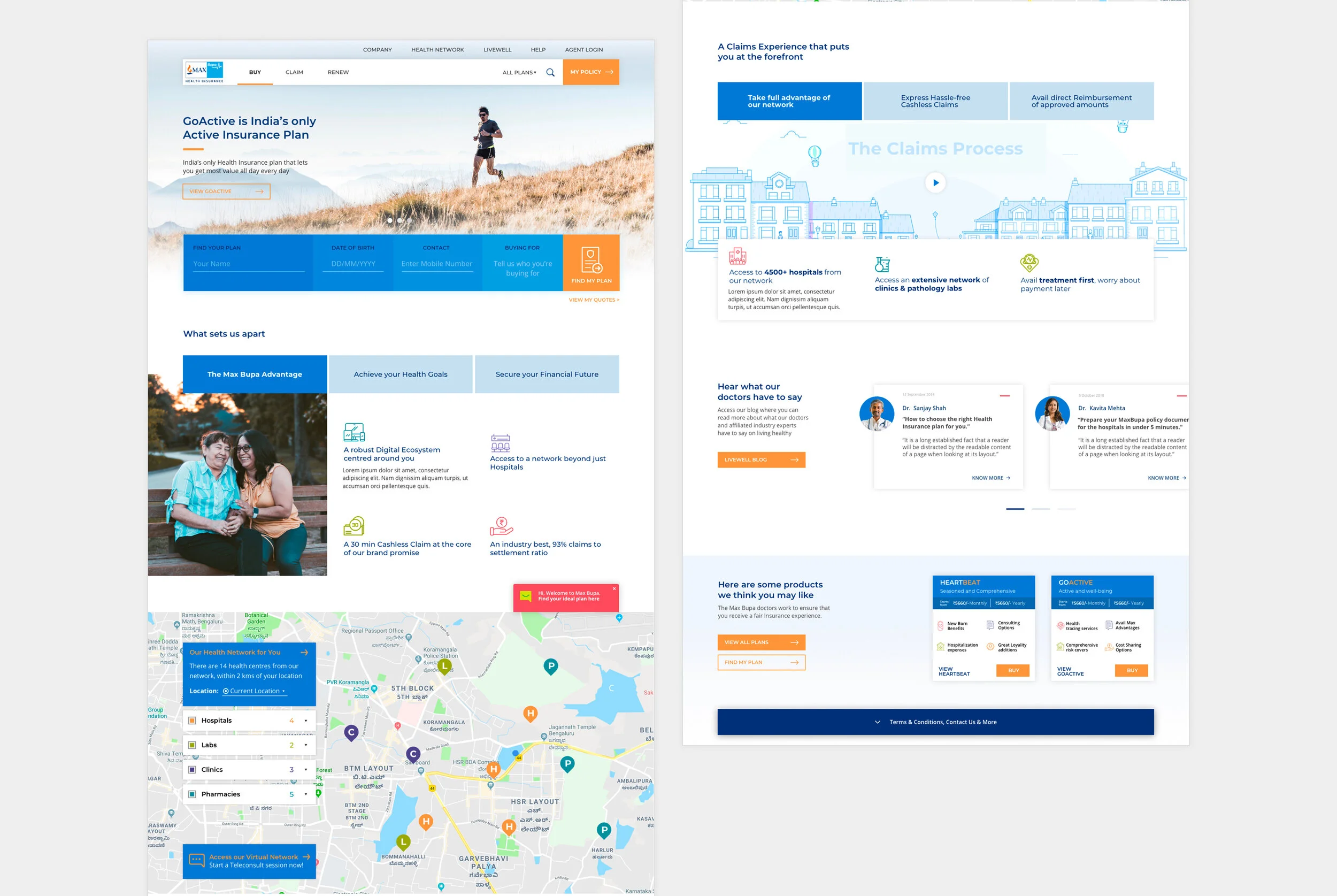
The Home Page
Our plan was to leverage Adobe’s AEM platform on which the new website would be built. One of AEM’s core capabilities is the ability to customise content and page flows based on the user behaviour. The Home Page is where the user is introduced to the brand, company and offerings for the first time. We wanted to customise the content based on the stage the user is in to add value in the relevant stage the decision making journey.